
The AirPulse brand kit
The Reference: logos, colour, type, the plate, marks and motion (rev. 23 Sep 2026). AI answers cite sources; AirPulse makes a brand the source, so the brand reads like a reference work.
The downloads predate The Reference. Logos are unchanged; colour and type on this page supersede the PDF.
Logo














- Full lockup
- The mark, the AirPulse.ai wordmark and the line MEASURE · ACT · GROW. Use it where there is room.
- Reduced forms
- The wordmark alone, or the mark alone in tight spots.
- Grounds
- White logo on Night, Forest or ink. Black logo on white or paper.
- The italic
- The italic Pulse in the wordmark is the seed of the type system. Never set the wordmark in another face.
- Clear space
- At least the height of the mark on all sides.
- Minimum size
- Wordmark 120 px wide on screen. Mark 24 px. Below that, use the mark only.
Colour
Field and mark
Forest owns the bookends; chartreuse is the spark. Keep chroma high: no greige, no washes.
Forest
The field: closing bands, the call-to-action band, headline figures, the offset edge under artifacts.
Night
The ground the hero plate is pulled toward. White type sits on it at 6 to 14:1.
Chartreuse
The mark: the primary button on dark grounds (ink text), the italic on dark, the drawn underline, the star hub.
Emerald
The italic accent on light grounds. 7.35:1 on white.
Ink and paper
Ink
Text, the primary button on light grounds, the 1.5px edge on artifacts.
White
The page ground below the hero.
Paper
Panels under artifacts, stat cells, drawing panels.
Sub
Secondary prose and supporting copy.
Meaning
State colours carry a literal label or a value, never decoration.
Named
A positive reading: named, cited, passing.
Not named
The brand is missing from the answer. The one warning colour.
Amber Ink
A check that needs attention.
Type
We get your brand recommended by AI.
We get your brand recommended by AI.
- Sentence
- Geist 400. Size and tracking carry the hierarchy, never weight.
- The turn
- Newsreader italic 500 on the one word or short phrase a heading turns on. One per heading, never the whole line.
- Accent colour
- Emerald on light grounds, chartreuse on dark. It rhymes with the italic Pulse in the wordmark.
- Metadata
- Geist Mono for labels, captions, figures in tables and code.
- Body
- Geist 400, 15 to 18px, reading columns of 32 to 40rem.
The plate
- Source
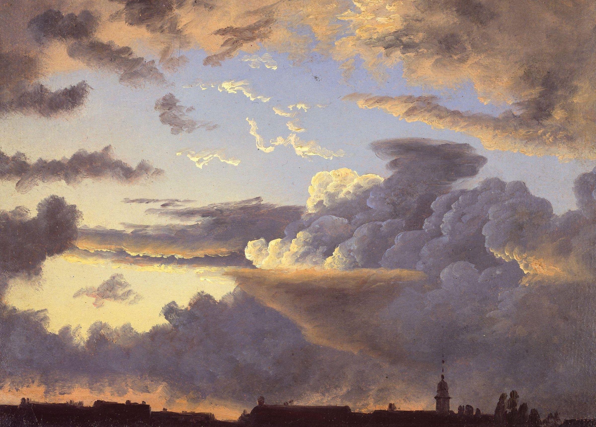
- Public-domain 19th-century oil studies of sky. The homepage plate is Knud Baade, Cloud Study (National Museum of Norway, NG.M.02657).
- Treatment
- Desaturated, cast Forest, pulled toward Night, so white type always sits on a deep even ground. The lit cloud edges stay visible.
- Placement
- Heroes only, full bleed, ending at a hard edge partway down the product artifact so it straddles plate and page.
- Motion
- The plate breathes: a 40s push-in and drift and a faint light crossing the top on a 26s period. Paused off screen, still under reduced motion.
- Never
- No caption or credit printed on the page, no light scrim behind dark type, no stock photography.
Marks
- Drawn underline
- A hand-drawn chartreuse stroke under the italic word, drawn left to right once the heading arrives (900ms, strong ease-out).
- Engraved star
- A small compass star in Forest with a chartreuse hub, in empty section margins only, turning slowly. Hidden under 1100px.
- Citation marker
- The bracketed source number lives inside answer artifacts, where it points at a real source. Never in a headline.
Shape, surface and motion
- Radii
- 3px on controls, chips and inputs. 10px on cards and frames. 20px on dialogs.
- Artifacts
- Product frames sit on a paper panel with a 1.5px ink edge and an 8px Forest offset: a page laid on a plate.
- Depth
- The offset edge is the only shadow. No blur shadows, no glows, no glass.
- Motion
- Sections arrive out of a soft blur and rise (data-fx). Transform and opacity only. Everything rests visible and stops under reduced motion.
Video and social
- Bug
- The white mark, bottom-right, small, on every video.
- Titles and lower thirds
- Geist in white on Night or Forest, the turn in chartreuse Newsreader italic.
- Accent
- One chartreuse element per frame.
- Files
- Circle avatar, YouTube banner and watermark are in the kit.
Do and do not
Do
- Use the supplied logo files as they are.
- Put one Newsreader italic word in a heading, emerald on light, chartreuse on dark.
- Use Forest for the bookends and chartreuse for the one thing to act on.
- Measure contrast against the real pixels behind type on imagery.
Do not
- Stretch, rotate, recolour, or add effects to the logo.
- Set chartreuse text on a light ground, or green text on a painted sky.
- Use more than one accent colour in a section, or pastel fills.
- Print footnote markers, plate credits or labels over imagery.